Agent landing page
A page of your own, at an address you choose
Every buyer who reaches About Time Tours has to be attached to an agent. Usually that is you typing their email into an invitation. The landing page is the other door: a public page at app.abouttimetours.com/agent/your-name, carrying your headshot, your bio, your brokerage and your colours, with a button that opens a signup already pointed at you.
$20 per agent per month after a 30-day free trial; $5 per agent per month for organizations of 51 to 1,000 agents; larger by agreement.
- An address you pick
- app.abouttimetours.com/agent/ plus whatever you type, once the app confirms it is free.
- Off until you say so
- A new account has the page off. Nothing resolves publicly until you enable it.
- It signs people up
- The main button drops a buyer into registration already attached to you.
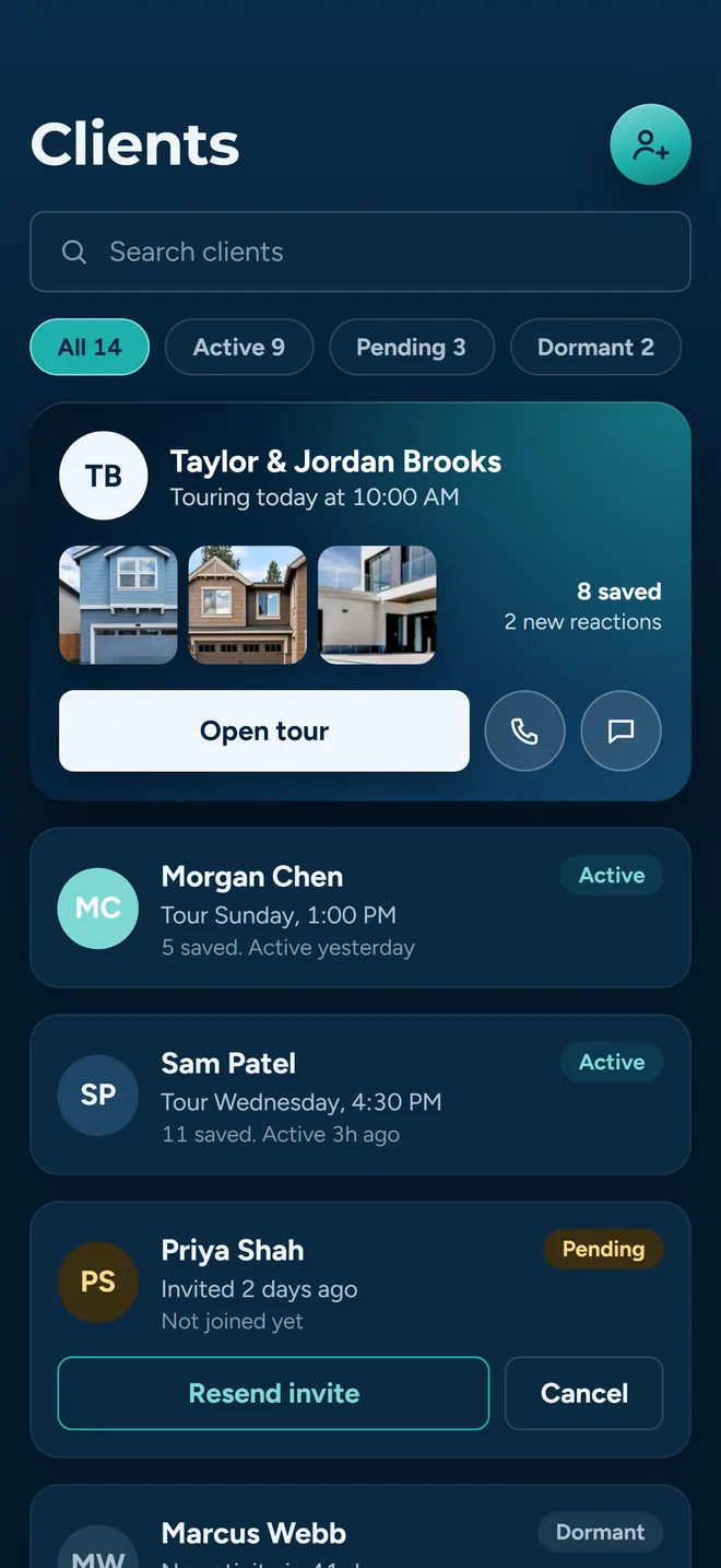
The client you invited by hand, still pending. The landing page is the version buyers start themselves.
Pick the URL, and find out in a second whether you can have it
Landing Page Settings opens from your dashboard. Your link is the first real decision on it. Type, pause for half a second, and the app checks the name against every other agent and reports back inline: a green Available, or the reason it will not work.
At least three characters
Anything shorter is rejected before the availability check runs.
Lowercase, numbers, hyphens
The field strips everything else as you type, so you cannot save a URL with a space or a capital in it.
Ten names are held back
admin, api, app, auth, dashboard, help, login, settings, signup and support are reserved. Asking for one gets you a named alternative.
Taken means taken
The check looks across every agent, ignoring your own record so re-saving your existing URL is never blocked.
A rejection comes with a suggestion
If the name you want is gone, the check tries the same name with 1, 2 and 3 on the end and offers the first one that is free. If those are gone too, it appends a short random suffix. You are never left staring at a dead end.
If the check itself fails
A network problem does not lock you out. The field says it could not verify availability and lets you save anyway, rather than pretending your name is taken.
The URL only gates the URL
Saving is blocked only when the page is switched on and the URL is missing or unavailable, and the screen prints exactly why the button is grey. With the page switched off, you can still save your brokerage, your office address and the rest.
What somebody actually sees when they open it
No login. The page is fetched by slug and rendered for anyone with the link. It is a stack of full-width sections; from 1024px up some of them pair off side by side, and on a phone they all stack. Every block on it is conditional: an empty field is an absent section, not an empty box.
The hero
Your headshot, name, title, brokerage, licence and city, under a headline you can write yourself. The panel itself is a fixed navy gradient in both light and dark mode, so the one thing it will never do is come out unreadable.
About me, and why work with me
Your bio, up to 500 characters, under a heading that uses your first name. Leave the bio empty and the block does not render. Beside it sits a short standing explanation of how touring with an agent works.
Areas I serve
The territories you have drawn in Settings, with a map, shown only if you switch the section on and have at least one. Your office address sits at the bottom of that block with a Directions link, or gets a block of its own if you have no territories.
Homes worth a look
Featured homes from your favorites, your own active MLS listings, or both behind a pair of tabs. Each card carries a Request a showing button running the same signup as everything else.
Let's talk
Call, Text, Email and Directions as round buttons, then your website, Facebook, LinkedIn and Instagram under Follow along. Each appears only if that detail is on your account, so nobody taps a dead button.
Powered by About Time Tours
Our logo sits in the footer, beside Equal Housing Opportunity and the MLS attribution. The header is yours. This is still your page inside our app, not a white-label site on your own domain.
A page that is switched off does not exist
The lookup only returns agents whose page is enabled. Turn the switch off and the URL stops resolving to you: a visitor gets an Agent Not Found screen with a link home, the same as a slug nobody has ever claimed. That is the off switch if you need one mid-season, and it does not cost you the name.
One colour, a background preset, two images, and a brokerage name that matches your card
The branding controls are deliberately small. There is no theme gallery and no layout editor. You pick one brand colour, choose one of three backgrounds and upload two images, and that is the whole surface, which means it takes about five minutes and it is hard to make ugly.
Where each colour lands
- Brand colour
- The accent: buttons, section eyebrows, icon tiles and links. The editor scores it against the page as you pick, so you can see before you save whether your brokerage red actually reads.
- Photo placeholder
- The block behind the person icon when there is no headshot uploaded yet.
- Background
- Not a free colour but a choice of three: a wash built from your brand colour, a plain neutral, or a custom colour. One too dark for the page text falls back to plain rather than shipping grey-on-grey.
The picker sits inline rather than in a modal: seven preset swatches, a saturation panel, a hue slider and a hex field, with the preview beside it moving while you drag. Paste the hex off your brokerage style guide if you have one.
The two images
A headshot, cropped square, and a company logo, cropped wide. Both go through a crop step before upload, then get resized down so the public page is not serving a phone-camera original. JPG, PNG or WEBP, up to 5MB. Anything bigger is refused up front with its actual size in the message rather than failing during the upload.
Brokerage and office
The brokerage field completes against a built-in list of twenty-five national names, and takes free text for everything else, so an independent shop is typed once and spelled the way you spell it. The office address runs through Places autocomplete and confirms once it has coordinates, which is what the map on the public page draws from.
Saving tells you what happened
A green banner confirms the write. A failure gets a red one that names the problem, suggests a fix, and shows the server’s own message underneath, and it stays on screen until you change something, instead of vanishing with a dismissed alert.
The point of the page is the button
A profile that only lists your phone number is a business card. What makes this worth a URL is that a buyer standing on it can become your client without you touching anything.
The button carries your ID
Sign up as my client opens the account screen with your agent ID in the link. On a phone it hands off to app.abouttimetours.com in the browser.
The invite step is skipped
Because the link already carries a code, the buyer never sees the do-you-have-an-invite screen. They land straight on Create Your Account, under a line that reads to connect with your name.
The link survives confirmation
The code rides along with the signup into the confirmation step. Once the account is confirmed, the backend resolves it (a pending invitation, an agent ID, or a landing page slug all work) and attaches the new client to you.
Without a link there is no way in
A buyer who opens the app cold gets no code box at all. The screen tells them to ask their agent for an invite or visit their agent's landing page. That is the gap this page fills.
The invitation you send yourself still exists and is still the right tool for someone you already have on the phone. See clients and favorites. The landing page is for the person who found you first.
Optional: the homes block
Two switches under Sections, both off by default, add a Homes worth a look block to the public page. Featured homes shows the properties in the first favorites list you created, so it is curated by the ordinary work of favoriting things rather than by a separate publishing screen you have to remember to update. My listings shows your own active MLS listings. Turn on both and the block gets a pair of tabs; turn on one and it just shows that one.
What each card shows
Photo, address, price, beds, baths and square footage, laid out one to three across depending on the width of the screen. Details come from the same MLS cache the app searches, so a card is never a stale hand-typed copy.
Every card is a second door
Each one carries a Request a showing button running the same signup as the main CTA. A visitor who cares about one particular house does not have to scroll back up to act on it.
Nothing saved, nothing shown
The block only renders when a switch is on and that list has something in it, and the same is true of every other section. Turn both off and the page goes back to hero, bio, areas and contact.
Getting the link out of the app
As soon as you have a URL saved, four actions appear in settings. Copy link puts the address on the clipboard and tells you it did. Share opens your phone’s own share sheet with the link and a line already written (save and tour properties with your name) so it goes out as a message, not as a naked URL. Text and Email open the same message in the right app. Under them sits a QR code with your initials on it, for an open house sign-in sheet, a flyer or a yard sign, and on a laptop you can download it as a PNG.
You do not have to publish to see what you have done. The editor keeps a live preview beside the form on a laptop, and a Preview tab beside Edit on a phone, so the colour you picked shows up before you save it. On a laptop, View page opens the real thing when you want to see it as a buyer does.
The address does not rotate or expire. It is the same string every time, which is what makes it usable in an email signature, a social bio, a listing flyer or a text to a referral.
Worth being straight about
- No visit counter. The page records nothing about who opened it. If you want to know whether a campaign worked, the signal is new clients arriving on your roster, not a dashboard.
- Not an IDX site. There is no property search on it. A visitor sees the homes you switched on, not a searchable feed, and cannot look anything else up without signing up.
- Not your domain. It lives at app.abouttimetours.com and carries our logo in the footer. You are choosing the last part of the path, not hosting a site.
- Coverage is specific. MLS coverage today is supported Oregon markets and Southeast Florida, which is what a buyer who signs up through your page can search. See coverage.
Related reading: territory activity, inviting and managing clients and the whole picture for buyer agents.
Claim the name before somebody else does
Slugs are first come, first served across every agent in the app. Setting one up is a headshot, a bio and a brand colour, and it takes about five minutes.
Already set up? Get the app on the App Store or Google Play.